Have you ever seen some really bad letter sp ac ing, the kind that makes any self respecting typographer wince?
Take a look at this one I saw whilst in Wellington, New Zealand…

I wonder what an ark for carp would look like!?
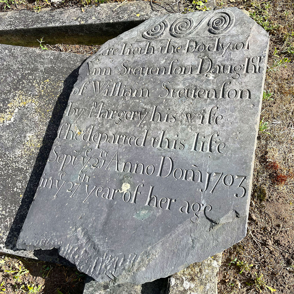
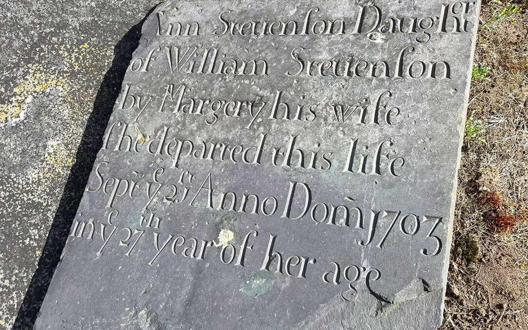
I love letters and spacing, I can spot a rogue space at a glance. However, whenever I come upon one of these old 18th C. slate headstones with the ‘squashed on’ ends of words where the slate ran out for the letter cutter always make me smile and feel warm inside – I love them! I found this one in a local village churchyard and it makes me wonder if this letter carver just started out cutting after a couple of ales at lunch time, it’s so relaxed and has a real freedom about it! I’m also fascinated that the old way of using an F for an S doesn’t include Feptember? Answers on a postcard if anyone knows why?
In my early years I trained as a compositor (hot-metal) which makes me a tad more pedantic about spacing and how the words I layout and hand carve look. The kerning (adjusting spacing between each letter) and the leading (the space between adjacent lines) will make all the difference to your work and the meaning of the words. Sometimes there’s a fair bit of adjusting going on in the workshop at the drawing up stage depending on the different type of fonts used. Some may need more than others.
If you would like to commission an old style headstone with it’s kerning all over the place then I’d love to have a go for you!
All the best,
Damian


love this Damian great idea words and spelling can be very funny sometimes I’m sure you will see a lot more on your travells. Lynne